

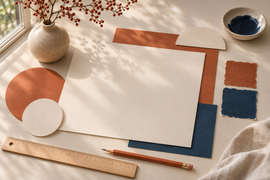
A limited colour study can begin with objects already on a desk. A notebook cover, a ceramic cup and a piece of packaging provide enough material for a modest experiment. Looking closely at familiar things is often more productive than searching for a perfect palette.
Choose three colours and describe their relationship in words before making digital swatches. One might form a calm background, another might carry most of the information, and a third might provide a small point of emphasis.
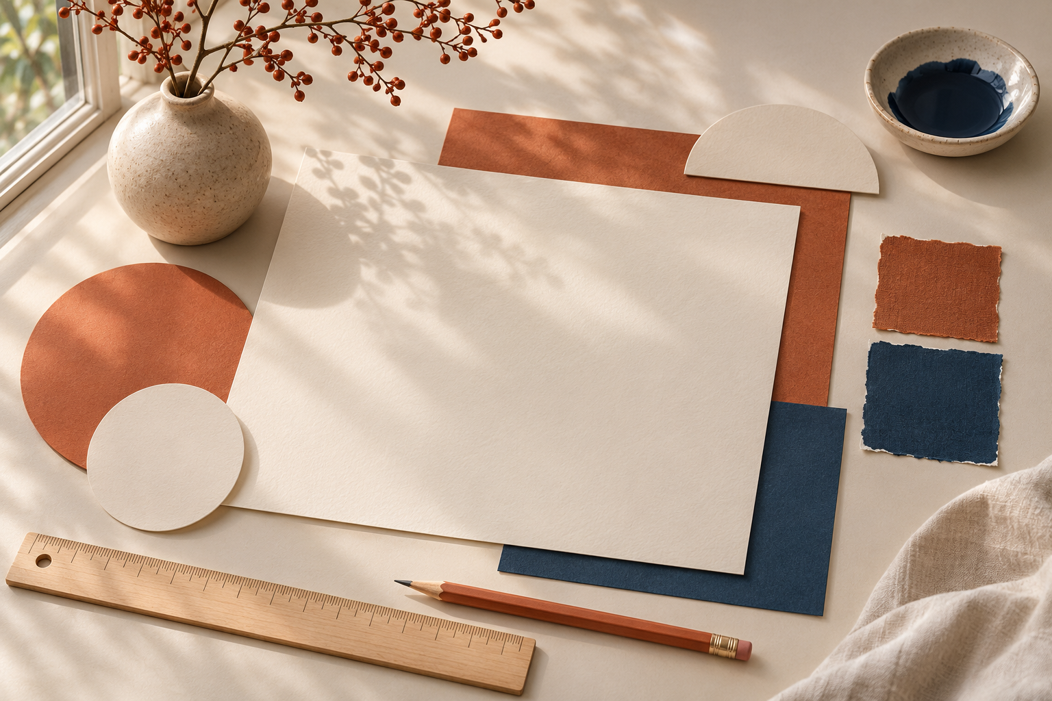
Test the colours on a simple page with real text. Notice whether the words remain comfortable to read and whether the emphasis falls in the intended place. A pleasing arrangement of swatches is only the beginning of the exercise.
Save the study beside a photograph of the original objects, clearly labelled as your own experiment. Returning to that pair later reveals how an observation became a design choice. The source can stay ordinary while the resulting decisions become more precise.